
I came across a great piece of content by a UI expert on tips for improving on page performance – both user experience and conversion.
One of the ideas that really resonated with me was on presenting a recommendation on the pricing page. I’ve had success with this idea in the past, but the way this was presented was novel to me and I really want to try it now:
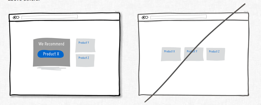 The paradox of choice is a real effect – people get overwhelmed by too many choices. (Although here is a nice critique of the hypothesis – a little choice is a good thing, which is pretty obvious.)
The thing I like about this design idea is that the recommend price is displayed in a very different way than the other choices. I’ve seen things where one price has a little banner over it or is slightly larger, but making the entire placement and design of the highlight choice different is really smart. Now I want to try it!