
I had a little technical difficulty with my blog for a few days there, but we are back online! Note that the blog didn’t go down, just the admin area so I couldn’t post. But I’m back!
Author: healyjones
My most clicked tweet of the week
StandardHas been on the hilariously offensive US Airways tweet.
So funny: RT @nycjim: @Mashable has compiled the 38 best Twitter reactions to the NSFW @Usair tweet http://buff.ly/P19fhz
What does that say about the people that follow me on Twitter?
Who knows, but if you want to find me, Healy Jones, on twitter, my handle is @healyhoops.
Webinar on how personalization drives sales
StandardSo, I’m a bit of a personalization junkie, especially when it comes to email marketing and lead scoring. For whatever reason, I find that stuff really fascinating.
My wife recently put on an informative webinar on how data science can lead to lasting customer relationships. Since it was totally great, I’m sharing it here on my blog!
The most interesting point, I think, is that segmenting on customer behavior can yield even better results than on product. In particular, hitting discount shoppers when there is a clearance sale vs. new product lines (at premium prices) to high value shoppers… makes a lot of sense!
Danger of going too cutting edge with UI
StandardMy buddy, Anand (he does mobile for Hubspot) turned me onto a great post that really resonated with me:
RT @anandrajaram: Side Drawer Navigation Could Cost Half Your User Engagement http://buff.ly/1hY1NPy
Turns out hamburgers are bad for engagement!
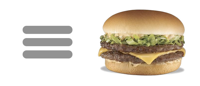 I’m not surprised by this – the hamburger (image source and more info on the hamburger design element here) is too cutting edge for most people. Nobody knows what it is! Just because mobile geeks get it doesn’t mean it will help improve ordinary people’s interactions with a product. This highlights a major danger in going too far with cutting edge design techniques, and not designing for the standard user.
Two wines: Carnivor cabernet and Pegaso Toscana
StandardI’ve been waiting to write another wine review until I could discover another great one like the Saint Francis Old Vines Zin… but I haven’t discovered anything amazing recently so I figured I ought to just talk about a couple I’ve had recently. My sister-in-law and her husband have been visiting recently, so it’s been easier to quickly try a few wines… alas, none have been great.

I got both of these wines, the Carnivor cabernet sauvignon and Pegaso Toscana, during a sale at Bevmo. They might be hard to find at other vendors.
Carnivor cabernet sauvignon 2011
I just had a glass of the 2011 Carnivor Cabernet. It’s an acceptable cab, and I think I got it for two for $25 or something, so it’s not very expensive. But… it’s only OK. The wine is a very exciting looking deep red, but when I smelled it I didn’t find too much of a nose. The body had an interesting smoky taste, and there was a slight but happy finish. But I don’t think it was particularly fruity or jammy, which is what I would have expected. Maybe some strawberry on the very end. All that being said, it wasn’t bad and for the price I’d say “ok.”
Pegaso Toscana Rosso 2011
I also got the Pegaso Toscana Rosso on sale at Bevmo. While I don’t remember the exact price, it doesn’t really matter since I won’t be getting it again. This is an example of an blah food wine that goes really bland on it’s own (yes, I like to have a glass while I’m cooking before I eat…) On it’s own it didn’t really have any particular flavor that I can point out. I had it with a nice bison bolognese, and it seemed to develop a little spirit, adding a bit of fruit and a finish. But still, not a great wine.
Hopefully I’ll come across something great soon!
Great data visualization post
StandardOne of the first things I do when I start a consulting project with a company is work on dashboards – What are the KPI’s and how are they being measured/tracked/presented. Do the decision makers have constant, in-their-face access to the metrics they need to make decisions.
I intend to write a longer post on dasbboards for direct marketing, but for now I’d like to share a great post on data presentation tips:
7 Data Presentation Tips: Think, Focus, Simplify, Calibrate, Visualize
Avinash Kaushik is a data guru and a data driven marketing thought leader. You should follow his blog!
Healy Jones blog update
StandardI started this blog as a way to share more personal info about me, Healy Jones, plus have a stable home for a lot of my marketing and tech startup writing. I’m happy to say that visitors have been growing quite a bit – and my most popular post so far was the one on wine, the St Francis Zin! So I’m going to write a few more wine posts in the near future – I may have finally found that decent, $10 bottle of red table wine that I’ve been searching for. You know it – the one you can open on a weeknight, really enjoy, but not feel guilty if you don’t polish off the bottle! Stay tuned…
I really liked this article on Apple’s design process
AsideAny company can copy the keystone of Apple’s design process http://qz.com/183861.
The balance between process and creativity can be pretty hard to achieve. This was a thoughtful post on how process can actually be liberating to creative people. I’m sure that, in practice, it sometimes felt overwhelming/annoying. But the idea is great.
Good post on keeping users engaged
StandardLead nurturing/keeping signed up users engaged is critically important, and since I’ve been consulting it’s been a recurring theme to my work with clients. Getting customers into the top of the funnel is only part of the game; keeping them engaged is the other half of being successful with a SaaS product and with any sort of a lead funnel.
I really enjoy setting up touchless sales nurturing programs. Today there are a few really great services that help marketing teams carefully, and automatically, keep users coming back to a service or moving along within a longer sales funnel. I came across a great piece on user engagement and it got a lot of Twitter love.
In addition to the various channels the author mentions, I’d add that using a personalization layer is key to keeping users from opting out of your nurturing program. Every single time I’ve ever tested a personalization layer, the message with personalization has out performed. For example, at Boundless, adding info about the subject matter that a student was studying, or their school name, etc resulted in better response rates, better engagement rates and happier users.
The best thing is that tools are out there to automatically help a marketer use personalization. There is really no reason to still be using a blast, one size fits all nurturing program if you are at scale.
Pricing page optimization and highlighting a choice
StandardI came across a great piece of content by a UI expert on tips for improving on page performance – both user experience and conversion.
One of the ideas that really resonated with me was on presenting a recommendation on the pricing page. I’ve had success with this idea in the past, but the way this was presented was novel to me and I really want to try it now:
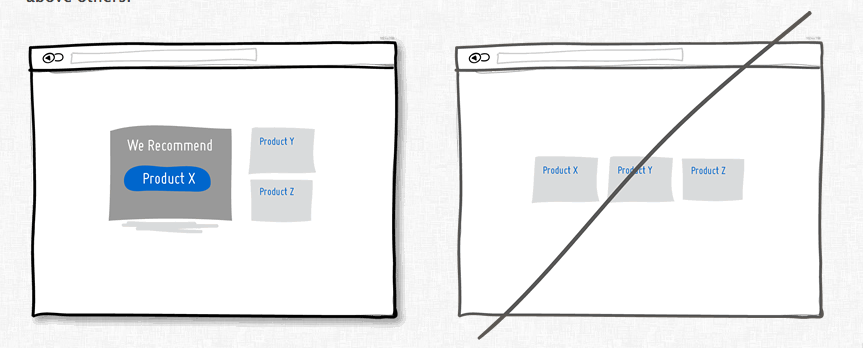 The paradox of choice is a real effect – people get overwhelmed by too many choices. (Although here is a nice critique of the hypothesis – a little choice is a good thing, which is pretty obvious.)
The thing I like about this design idea is that the recommend price is displayed in a very different way than the other choices. I’ve seen things where one price has a little banner over it or is slightly larger, but making the entire placement and design of the highlight choice different is really smart. Now I want to try it!